Improving Accessibility & Ticket Conversion Through UX Audit
Team
Rohitha Remala
Roles

Overview
Bardavon Presents is a nonprofit performing arts organization presenting world-class music, theater, dance, film, and community arts programming from historic venues such as the Bardavon 1869 Opera House and the Ulster Performing Arts Center in the Hudson Valley. Their mission includes making the arts accessible to diverse audiences through education, outreach, and high-quality live events.
Engagement Partner / Contractor
Lunch Special is a creative design and strategy studio that shapes how brands look, sound, and behave across digital and physical spaces. They work with cultural, community, and change-oriented organizations to craft thoughtful brand and experience solutions.
Design Scope
While the website successfully reflected Bardavon’s artistic mission and established brand presence, several UX issues were limiting its effectiveness as a discovery and conversion tool—particularly for a core audience that is less tech-savvy and more familiar with traditional, content-dense website patterns.
Key challenges included:
-
Accessibility gaps affecting readability, contrast, and keyboard navigation
-
Navigation complexity that made it difficult for users to discover events and show details
-
Drop-offs in the ticket purchase journey due to unclear hierarchy and call-to-action placement
-
Inconsistent layout patterns across pages, increasing cognitive load
Many users rely on familiar, legacy web conventions and expect clear, predictable structures rather than modern or abstract layouts. The challenge was to improve usability, inclusivity, and conversion while respecting these audience expectations—enhancing clarity and ease of use without disrupting Bardavon’s established brand identity or the constraints of the existing platform.

Approach
behavior, working in close partnership with Lunch Special and the development team.
Audit methods included:
-
Heuristic evaluation of key user flows (event discovery, show details, ticket purchase entry)
-
Accessibility review aligned with WCAG best practices
-
Navigation and information architecture analysis
-
Page-level layout and visual hierarchy assessment
Findings were documented and prioritized based on user impact, implementation effort, and relevance to Bardavon’s mission and business goals.
Audit Report
This UX audit evaluated the effectiveness, accessibility, and usability of the Bardavon Presents website, with a focus on event discovery and ticket purchase readiness. The findings presented here represent a curated subset of the broader audit, selected to highlight the most impactful themes.
While the site reflects Bardavon’s cultural identity, the audit identified usability and consistency issues affecting clarity, accessibility, and conversion. Key opportunities include improving visual hierarchy, reducing navigation friction, and strengthening accessibility compliance—without altering the brand’s core look and feel.
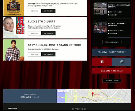
Call-to-Action & Interaction Hierarchy
-
Primary calls-to-action compete visually with secondary actions, reducing clarity on intended next steps.
-
Multiple elements appear styled as primary CTAs within the same view.
-
“Coming Soon” appears visually interactive despite being informational.
-
“Upcoming” and “Coming Soon” communicate overlapping meaning, resulting in redundancy.
-
Secondary buttons show hover states that resemble disabled elements.
Impact
Users may hesitate or misinterpret available actions, increasing friction during event discovery and ticket entry.

Visual Hierarchy, Layout & Consistency
-
Primary calls-to-action compete visually with secondary actions, reducing clarity on intended next steps.
-
Multiple elements appear styled as primary CTAs within the same view.
-
“Coming Soon” appears visually interactive despite being informational.
-
“Upcoming” and “Coming Soon” communicate overlapping meaning, resulting in redundancy.
-
Secondary buttons show hover states that resemble disabled elements.
Impact
Users may hesitate or misinterpret available actions, increasing friction during event discovery and ticket entry.

Navigation & Hero
Observations
-
Two primary navigation menus are presented without a clear hierarchy, creating confusion about where to begin and how content is organized.
-
Navigation labels and page structure introduce friction when browsing events.
-
Event lists are not consistently ordered chronologically.
-
“View All Events” behavior is ambiguous (pagination vs. load more).
Impact
Users struggle to quickly understand what is happening now, what is upcoming, and which navigation path to follow when exploring the full event catalog.
Design Recommendations & Execution
I translated audit findings into clear, actionable design recommendations and partnered closely with the web development team to support execution.
Key contributions included:
-
Redesigning page layouts to improve hierarchy, scannability, and CTA visibility
-
Refining navigation structure to simplify event discovery and reduce friction
-
Improving accessibility through contrast adjustments, clearer typography, and interaction states
-
Updating visual system elements to support consistency while preserving Bardavon’s brand character
Continuous collaboration with engineering ensured recommendations were feasible, accurately implemented, and aligned with technical constraints.


